The black glass house celebrates its 20th anniversary
Science Park Library: an award-winning study house
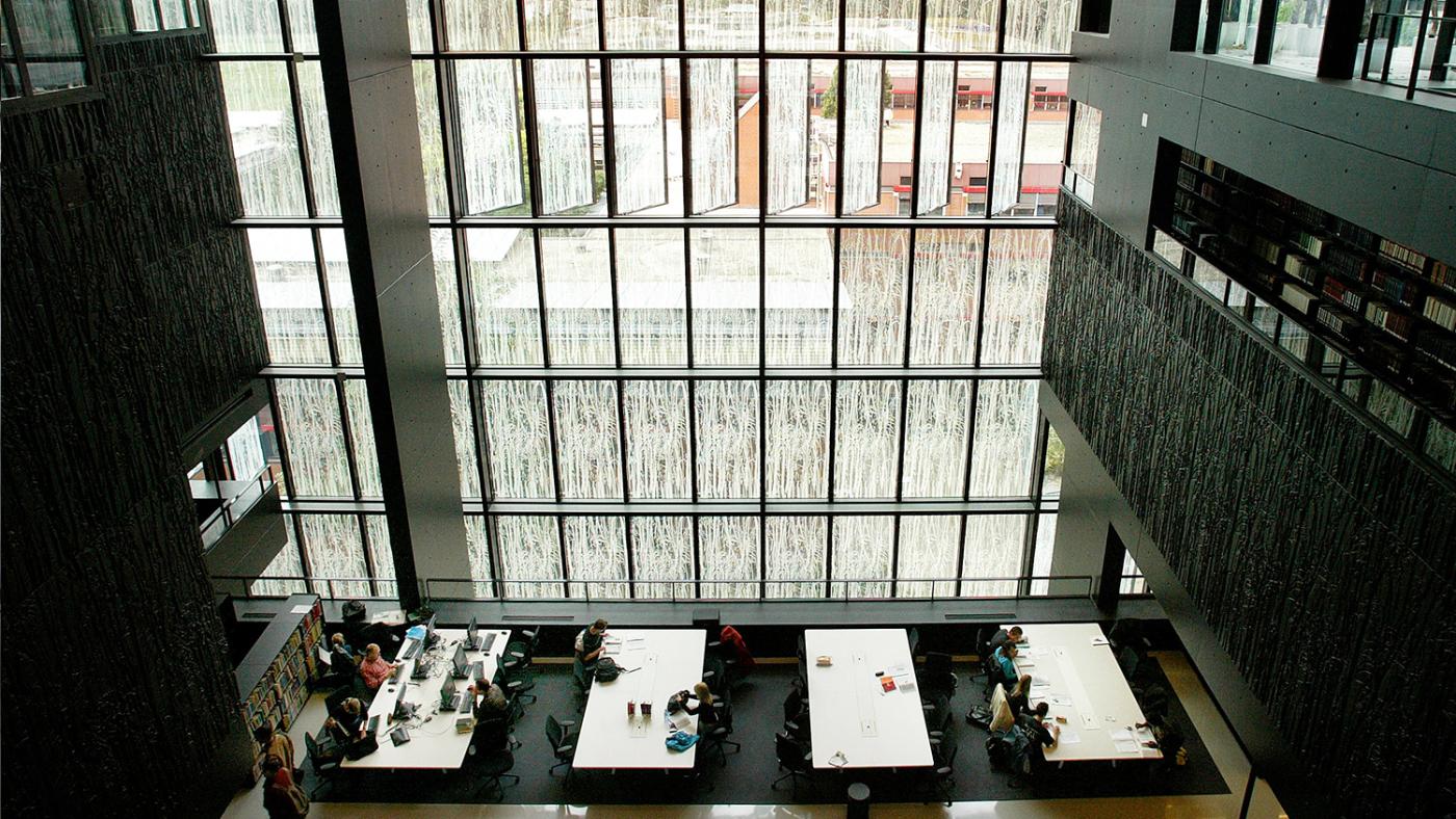
The plan for a central university library in what was then called De Uithof arose at the end of the last century. The idea was to move books from the small libraries maintained by several study programmes there, as well as the books of a larger library on Wittevrouwenstraat. The new library would become the heart of the campus, hence the need for it to be a building with a lot of appeal, recalls Bas Savenije, who was a librarian and commissioner at the time. “It had to be a meeting place for students", he says, and the building department was commissioning talented architects to build beautiful buildings at De Uithof. Rem Koolhaas designed the Educatorium, while the duo Neutelings and Riedijk designed the Minnaert building, for instance. “I had no problems hiring a good architect, of course!”
About forty architects sent their proposals. Savenije and his team shortlisted five. Ben van Berkel, who had designed the iconic Erasmus Bridge a few years prior (and would later design the Bloembergen building at De Uithof), was one of them. In the end, Savenije chose Wiel Arets, with whom he interacted a lot during the presentation. “Wiel had only brought a single picture with him: an image of Mondriaan’s Victory Boogie Woogie. That was his inspiration. And then he started drawing based on what we wanted.”
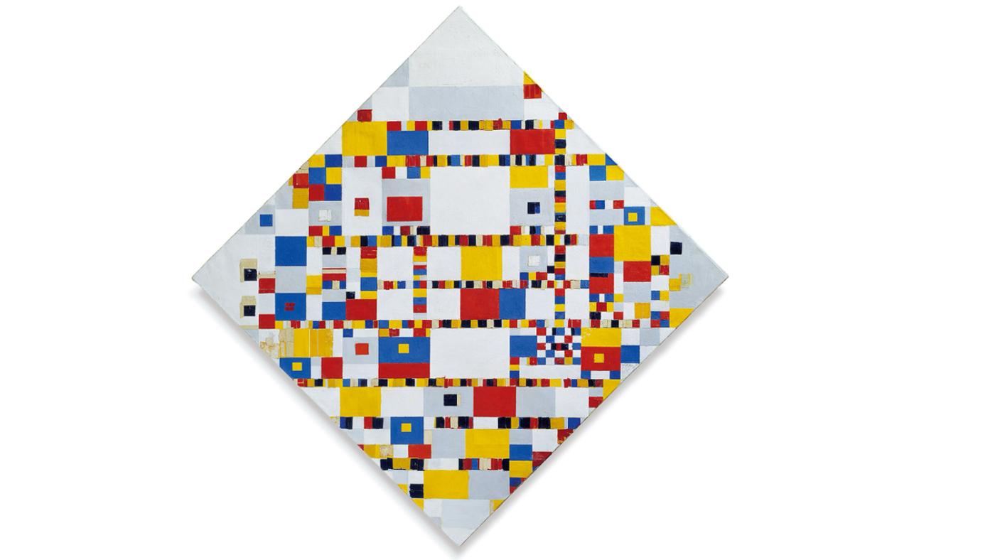
Victory Boogie Woogie by Piet Mondriaan. Photo: Wikimedia Commons
Respect
Arets was then given the assignment. The new library had to meet an extensive list of requirements, but other than that, he had creative freedom. One of the university’s wishes was that visitors would be able to see the employees working in the offices and depots, and vice-versa. Arets thought of an open structure to meet that demand.
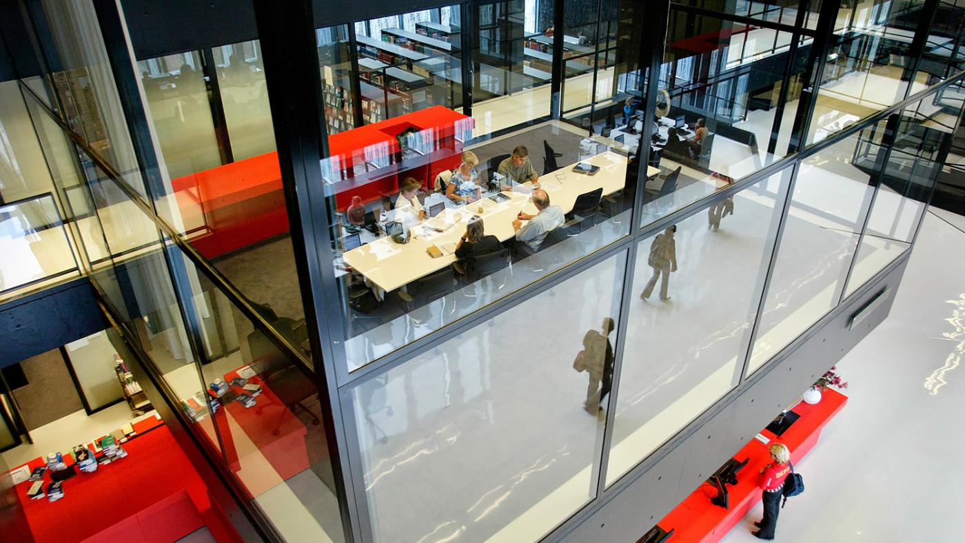
The library's open structure. Photo: DUB
Arets travelled with Savenije to the public library in Münster, Germany, and the State Library in Berlin for inspiration. “The Münster library has a very open reading room, like a big valley. You could hear a pin drop there.” Savenije also identifies elements of the library of the boys’ boarding school in Exeter, USA, in the University Library's design. “That one also has an open structure, only with nooks and crannies.” Savenije was amazed at how neat and sleek it still looked despite all the teenagers. He asked the director how that was possible. “That’s because they respect the building,' he said. And I never forgot it.'"
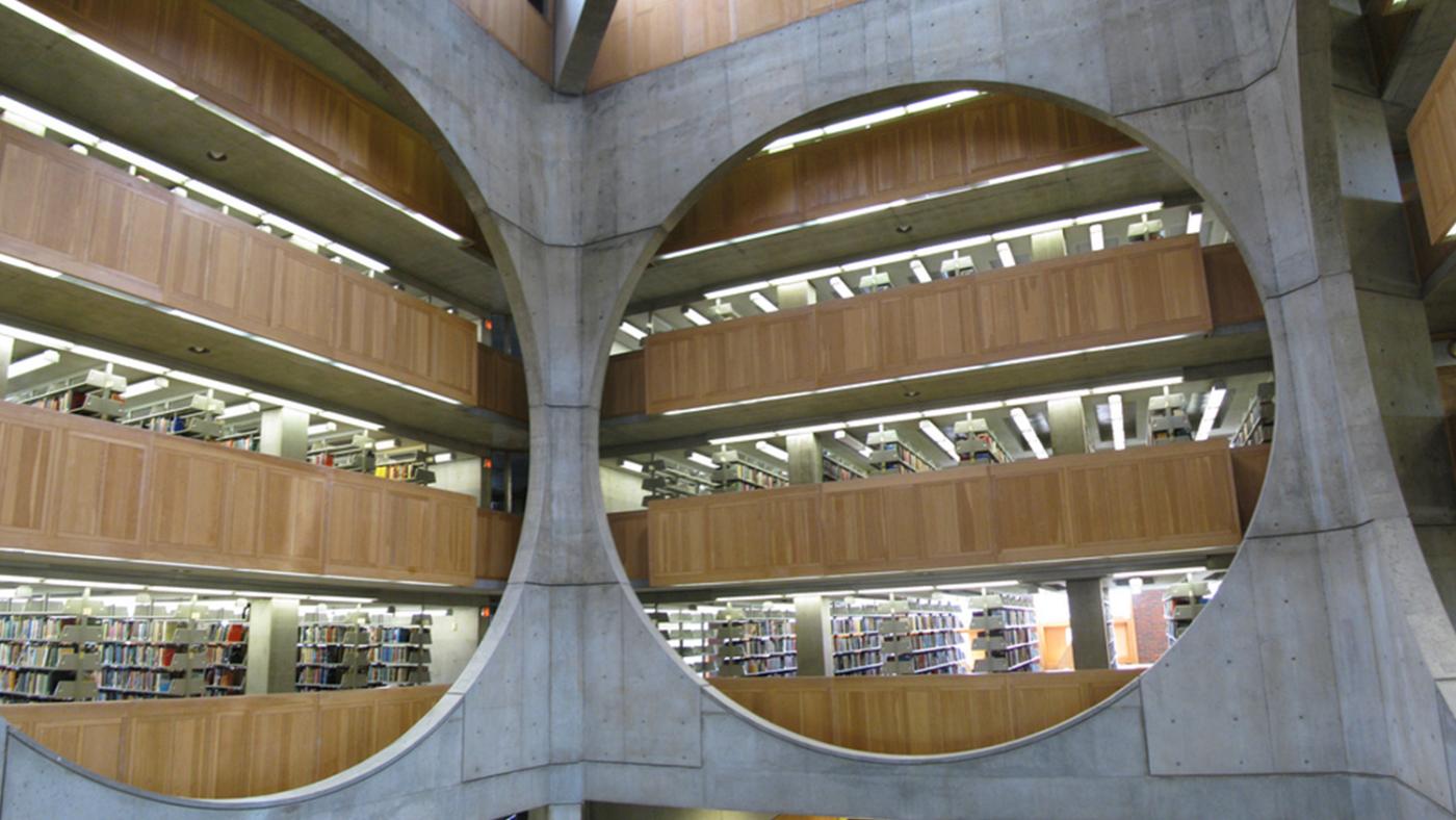
Phillips Exeter Library, New Hampshire. Photo: Pablo Sanchez
Costs and teething problems
It was important for Arets to make the collection visible. The depots – as the rooms where special books are kept are called – became floating blocks in a large open space, topped by the reading rooms and study areas. A relief was printed on the side of the depots, based on a photograph by Kim Zwarts, who often collaborates with architects. Though the relief looks like bamboo at first glance, they actually depict willow trees. And it's not only there for decorative purposes: the relief provides sound insulation as well. Zwarts' photo is also printed on the glass plates put on the sides of the façade, which offers sun protection, blocking just over fifty percent of the light.

The Utrecht Science Park while it was being built. Photo: DUB's archive.
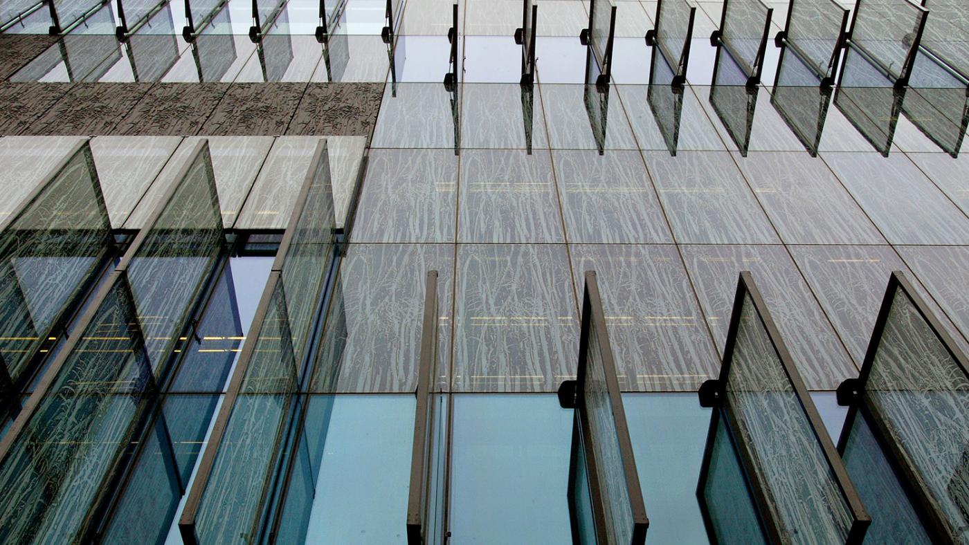
The windows with the willow motif. Photo: DUB
The construction costs were a frequent topic of discussion in the University Council. The university had earmarked 100.5 million guilders for the project, but at least 155 million were needed. An increase that the University Council only agreed to after much discussion.
To address the dissatisfaction with the costs, Savenije made the Booth Hall available to the university, free of charge, for all academic purposes. “De Uithof finally had an additional auditorium and it got very popular in no time. We also organised guided tours to give people the feeling that the building belonged to the university."
Sex at the library
Aret’s design won awards like the Rietveld Prize and the Beton Prize, both in 2005. He was praised for his extensive and innovative use of cement. However, not everyone was excited about the building: there were a few teething problems too. In the toilets downstairs, a mirror was placed near the urinals in such a way that people could look straight into the crotch of a urinating man upon entering the space. In addition, the cream-coloured floor made it difficult to see where the stairs began in the hall. "A little black tape should prevent visitors from breaking their legs," published DUB's predecessor in print, UBlad, on September 23, 2004. The tape was stuck to the floor after Savenije himself was “the first person to fall from the raised ramp on the first floor.”

Photo: DUB's archive
Some employees found the extensive use of the black depressing. Colourful cushions were placed on the windowsills to brighten up the offices. “It’s so dark in here with these black walls. Hence the cushions,” said an employee at the time. On the third floor, the slightly translucent doors, behind which one can see shadows moving, disturbed toilet users. What's more, the possibility of locking the study rooms on the sixth floor from the inside brought about unforeseen consequences. Since the doors were made of frosted glass, it quickly became a place for sexual escapades. The doors have been completely removed, but for a completely different reason: ventilation, a remnant from the Covid-19 pandemic.
Fire drill
Most things were relatively easy to fix, but one thing remains a sore point for Savenije. “We wanted to have an appealing entrance so that people would be sucked into the library, as it were, upon arriving.” His vision was, therefore, much different from the three revolving doors we see now. “The architect’s idea was to let people enter through a small entrance, go up the stairs, and be completely overwhelmed by the grandeur of the building,” he explains. Art also thought that a single revolving door would provide visitors with an opportunity to interact, as they would have to wait for the whole group to pass, one by one.
Savenije still remembers a fire drill that was held at the time. “I sat down on the stairs to watch people go out through those doors,” he says with a laugh. “I was hoping that the doors would turn out to be insufficient in the event of a fire alarm, which would allow us to demand something else. However, when the fire alarm went off, two more doors opened, so everyone could get out.”
Hardly anything has changed in the building in twenty years. After all, changing such a building doesn’t happen just like that: the university has agreed on certain things with the architect. Savenike explains that this is not unusual. One of the things that have been agreed upon is that the photo of Arets’ children, which has been hanging on the wall of the espresso bar Gutenberg for 20 years, should remain there.
In 2016, the University Library at Utrecht Science Park was named one of the seventeen most beautiful libraries in the world by CNN. This year, the municipality designated the University Library as a young monument, which means it may not be rebuilt or demolished without special permission. People from all over the world still come to Utrecht to see this building with their own eyes.

The library's merchandise to celebrate its 20th anniversary. Photo: Dirk Hooijer